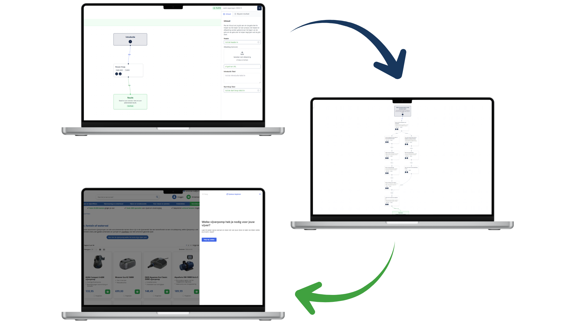
This is a familiar scenario in e-commerce: you’ve invested time in building an advanced product finder. The logic is solid, the questions are sharp, and the recommendations are spot on. Yet after a month, analytics show that only a small fraction of visitors actually use the tool. Is the product finder unnecessary? Probably not. In most cases, customers simply can’t find the help at the exact moment choice overload kicks in.
Guided selling isn’t just about what you ask, but especially about where you ask it.
In this article, we move beyond the standard implementation and take a closer look at the customer journey. Where do customers get stuck? And how do you make sure your digital salesperson appears at exactly the right moment? We analyze the data and list the most impactful locations, ordered to match the modern customer journey.
Data-driven placement: Look beyond gut feeling
Before diving into specific placements, it’s important to understand that there is no single “holy grail” location. What works for a fashion retailer may be completely different for an electronics webshop.
The key lies in your data. Dive into Google Analytics (GA4) and analyze your landing pages. Many webshops focus their navigation on the homepage, while traffic from Google Shopping and SEO often lands directly on product pages or deep within categories. If your product finder is only accessible via the homepage, you’re invisible to a large part of your potential customers.
The bounce rate is another strong indicator. High drop-off on a specific page often signals confusion or a mismatch in expectations. That’s exactly where your product finder should act as a lifeline.
According to our experience, these are the most strategic places to throw out that lifeline:
1. “Zero Results” and Search Results Pages
We start with a frequently overlooked but extremely powerful location: the internal search function. Visitors who use search have high purchase intent. But someone searching for a generic term like “Laptop” or “Running shoes” often doesn’t yet know exactly what they need.
The result is usually a page with hundreds of options, leading to immediate choice overload. By placing your product finder directly above the search results (“Looking for a laptop? Answer 3 questions and find the best match”), you catch customers before they drown in the assortment. This is guided selling at its purest: helping at the exact moment the customer signals uncertainty.
2. The Product Detail Page (PDP) as a safety net
As mentioned earlier, many visitors land directly on a product page via ads. Imagine a visitor clicks an ad for a €300 professional drill. Once on the page, they realize the price or specifications are overkill — they were actually looking for a simple drill for home use.
Without a product finder, this visitor leaves (back to Google). With a product finder on the PDP, you can retain them. Add a pop-up or a clear banner near the specifications: “Not exactly what you’re looking for? Find the drill that fits your job here.”
In this way, the tool acts as a retention tool. You guide the visitor from a mismatch to a perfect match without them leaving your site. Case studies show that conversions on product pages can increase significantly this way.
3. Contextual integration in blogs and content
Content marketing is the ideal place to build authority. Customers reading blogs like “The 5 differences between OLED and QLED” or “What ski length do I need?” are in the orientation phase. They’re not ready to buy yet, but they are ready to learn.
This is the moment to guide them. A hard “BUY NOW” button backfires here, but a product finder feels like a service.
- In-page: Place the product finder in the middle of the content so it becomes part of the story.
- Full-page: Link at the end of the article to a dedicated page where visitors can complete the full guide.
By connecting advice with educational content, you warm up leads naturally for conversion.
4. Prominent placement on category listing pages
This is the most conventional location, but no less important. On a category page, customers are confronted with the full assortment — the paradox of choice is real here.
You have several integration options:
- Header: A full-width banner above the products that immediately grabs attention.
- In-page app: Between products or replacing the top row. On mobile, this is often more user-friendly than a full-screen pop-up.
- Pop-up: Let visitors answer questions in a focused environment, without distractions from filters or prices.
Make sure the product finder is relevant to the specific subcategory. A generic “gift guide” performs poorly on a page dedicated to “Espresso machines.”
5. Behavior-driven triggers (exit intent & time on site)
Sometimes visitors simply overlook banners (“banner blindness”). In those cases, behavior-based triggers can help.
- Time on site: Has a visitor been scrolling a category page for 45 seconds without clicking? Trigger a subtle pop-up in the corner: “Need help choosing? We’ve got you.”
- Exit intent: Does the mouse move toward closing the tab? Make one last attempt to help with advice.
Always keep UX in mind. These triggers should feel helpful, not intrusive. Make sure they’re easy to dismiss.
6. Customer service & chatbots
Your customer support team is a goldmine of information. Do they receive the same questions repeatedly (“Does this part fit my car?”, “Which size do I need?”)? That’s a perfect opportunity for automation.
Integrate your product finder into the default chatbot or live chat flow. Before speaking to an agent, the bot can ask: “Would you like advice on which product fits you best?” This reduces pressure on support teams and gives customers instant answers — even outside office hours.
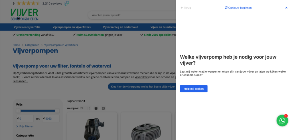
7. Navigation and dedicated pages
For returning visitors or those coming via word of mouth, it helps to give the product finder a permanent place in your site structure. Add “Product Finder” or “Product Advice” to your main menu or footer, linking to a dedicated landing page where the guide runs full screen.
These pages are also extremely valuable for marketing campaigns. Instead of sending ad traffic to a busy category page, send it to a calm, advice-focused landing page. Conversion rates on these pages are often significantly higher due to minimal distraction.
8. Email marketing and newsletters
Finally, don’t forget your existing customer base. The start of a new season or a sales period is the perfect time to promote your product finder via email. Don’t send a generic “Check out our new collection,” but instead: “Discover which new collection fits your style.”
Personalized messaging increases click-through rates. A newsletter link that leads directly to the product finder drives highly qualified traffic to your webshop.
Conclusion: Be present, not pushy
Successful guided selling is all about relevance. You don’t want to shout for attention — you want to be there at the moment a customer hesitates. By offering your product finder at multiple touchpoints in the customer journey — from search and chat to newsletters and PDPs — you create a safety net that removes doubt and drives conversion.
Start by analyzing your “leaky buckets” (pages with high drop-off) and place your first pilot there. Test, measure, and optimize. Because in e-commerce, the winners are those who understand their customers best — and guide them most effectively.
Want to see how your webshop can benefit from this?
Ready to get started?
Discover how Bebolu helps your webshop grow with interactive product finders.
Book a demo